- Show us your creative mind at work. Take us on a journey through a card-making session, start to finish.
- How do you select colors, layout, embellishments, and overall design?
- Share your creative process with us.
OK, so are you ready for lots of pictures? I’m going to walk you through how *I* go about designing a card from a sketch. I pretty much do the same things no matter what my starting place is. If I’m working on a color challenge, or an inspiration piece, I almost always start with my layout. Mind you, that layout may change in the process, but that’s where I start. The exception to this rule is when I have to use a particular stamp set, say, for teasers. Then, obviously, I start with the set, but my next step is to find a sketch that will work with that set. So, let’s get to it, shall we?
*******
I’m going to show you how I designed my card for MFT’s Wednesday Sketch Challenge #56. First, I pulled up the sketch on my computer—I keep it in front of me the entire time I’m working.

*******
I knew I wanted to make a Valentine card so next I got out all my Valentine paper to see which one “spoke” to me the most.

*******
I decided to go with MME ‘Love Me’ collection and then worked on choosing papers. I pulled out several designs and card stocks and switched them all around until I decided this was the arrangement I liked the best.

*******
Then I decided on what stamp set I wanted to use. I chose to use Inspired by Love, which hadn’t see any love lately ;-) I went with the fancy heart as my focal image.

*******
My next step was to see what Die-namics die I wanted to use for that circular element. So, I tried out the image I’d chosen from the set to see what die I liked best for this image. I chose the Dizzy Doily Die-namics die for this one.

*******
But…I think the heart looks a little lost on the large die and it was too large for the sketch, as well, so…

*******
…I tried it out on the largest of the Dizzy Doily Duo Die-namics dies and it was “just right” :)

*******
Next, I roughly laid out all my elements to see if this was really the way I wanted to go. This is where I’ll adjust a sketch a bit if necessary…

*******
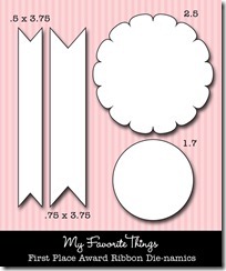
This is where I decided on my sentiment. Since I was going to use the flag from First Place Award Ribbon Die-namics die set, the sentiment had to fit on the flag. I tried several out but decided to go with this one from Clearly Sentimental About Romance.

*******
…and then I firmed up my design but don’t put it together yet.

*******
Now I needed to decide on some embellishments. To do this, I brought out several things I thought might work…

*******
…and then rejected them all for this. I felt I needed a little more aqua blue on the card so first I tried some turquoise baker’s twine. But, it was too dark so I went with red and a dark aqua button. I think this balanced it out nicely.

*******
I was happy with that so the only thing left to do was put it together and here’s the finished result. Sometimes I decide to sew on a card—actually, I have to make myself NOT sew on a card sometimes, LOL! I fear they’ll all look alike if I do that, so I mix it up. This one seemed to *need* sewing so I did it.

So, that’s it! That’s the way I go about creating a card. I hope I’ve given you a few tips for making the creative process easier for you!
Thanks so much for stopping by! I'll be back tomorrow with this week's MFT Wednesday Sketch Challenge!


